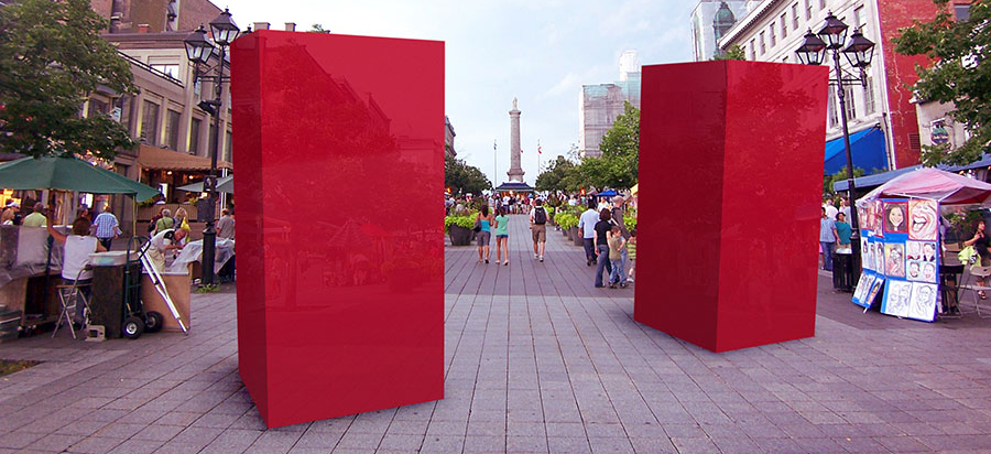
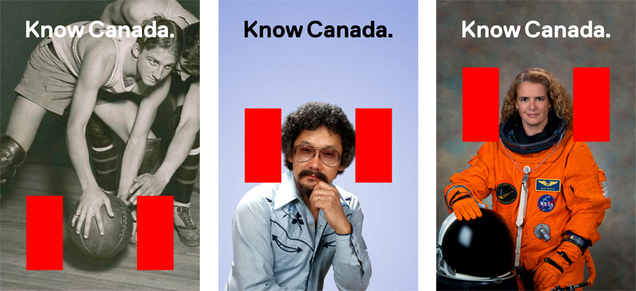
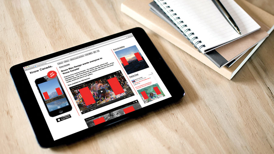
Bruce Mau Design was approached by the public radio show Studio 360 to re-imagine Canadian visual language for Americans. During our initial research, we were not all together surprised to learn that, when asked what they knew about Canada, few Americans could produce more than a few short sentences on the subjects of beavers, mounties, and maple leaves. If our purpose was to educate Americans about the rich history, culture, and natural beauty of their neighbor to the north, we knew we weren’t going to do it by creating yet another simplified and restrictive visual system. We wanted to show Canada … all of it. It was an ambitious goal and we needed help. We developed a free iPhone app and photo-sharing website that allowed anyone in Canada to use our system to create their own version of what Canada looks like. The project has since earned numerous awards and recognition, including being listed in Fast Company’s Best Branding of 2012.
Redesigning Canada
Client: Studio 360 with Kurt Andersen
Role: Designer
Team: Hunter Tura, Sarah Foelske, Nick Hum