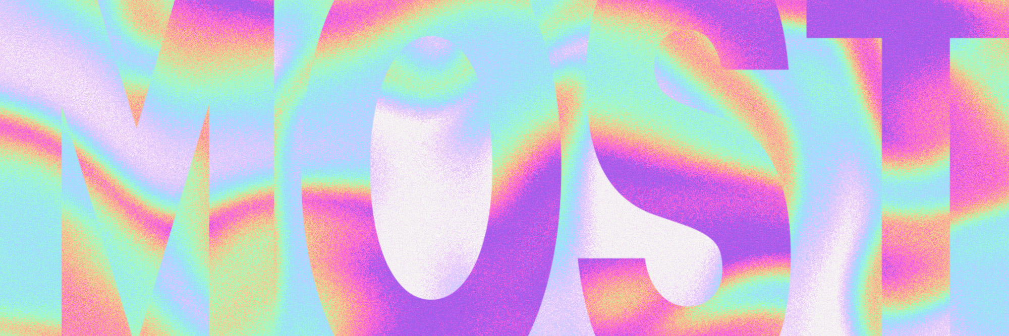
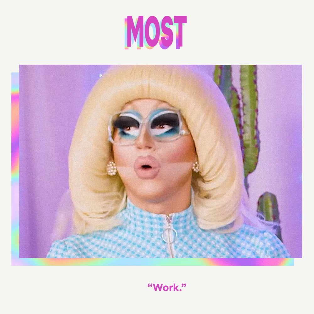
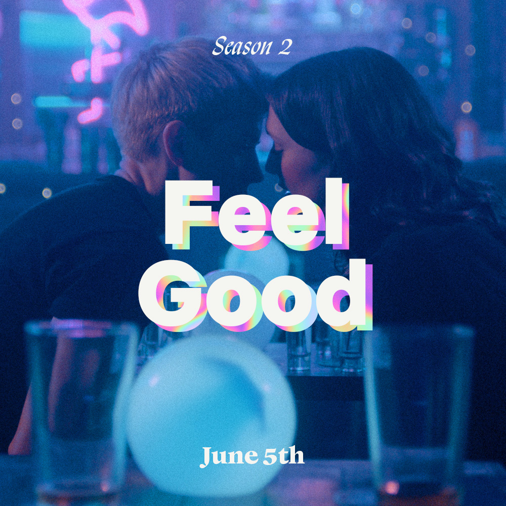
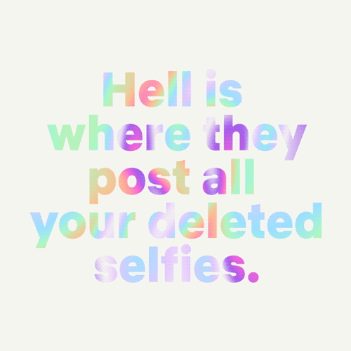
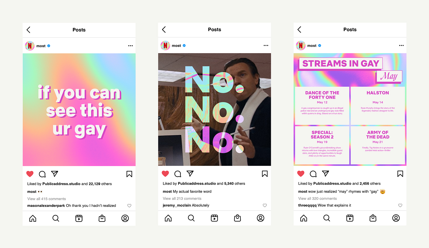
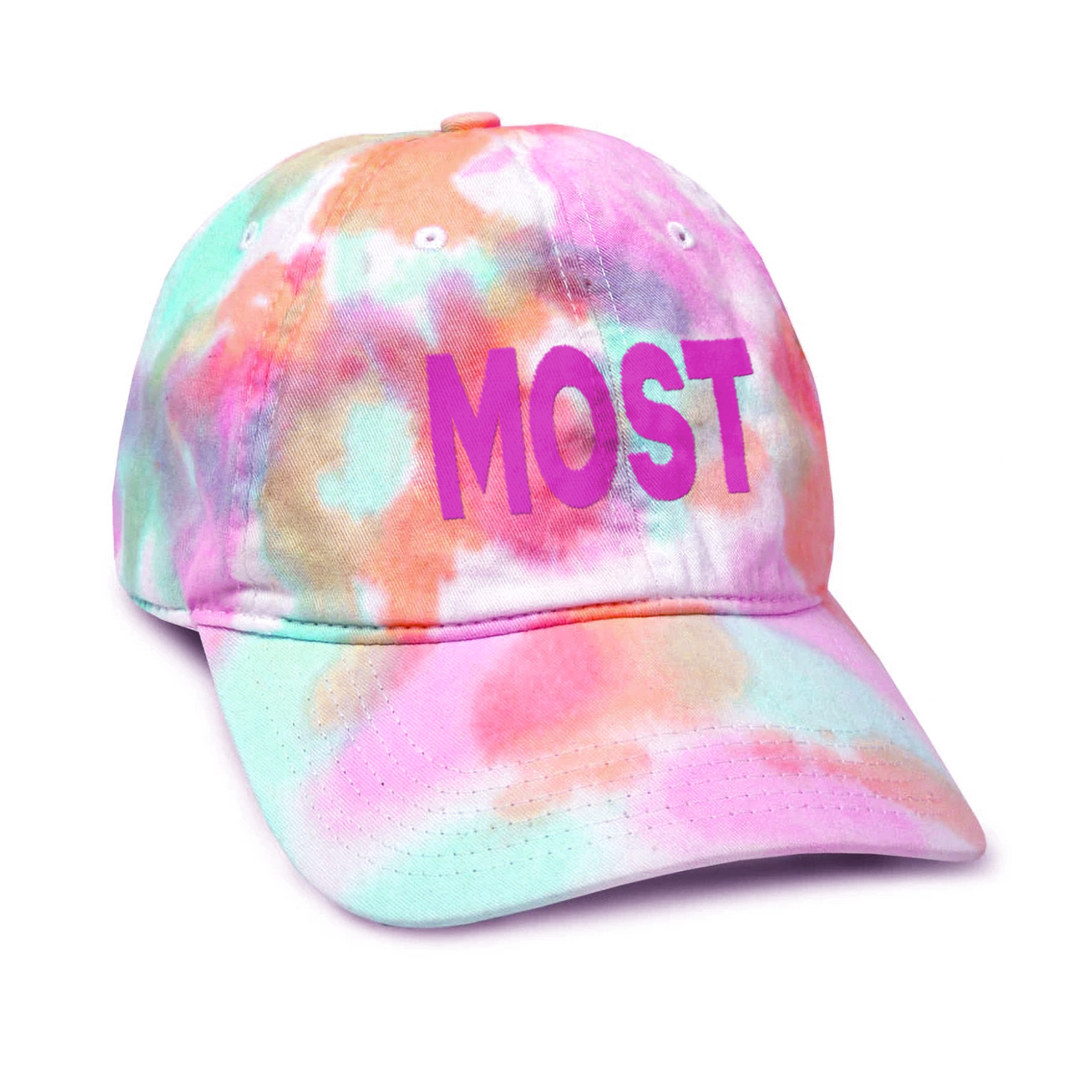
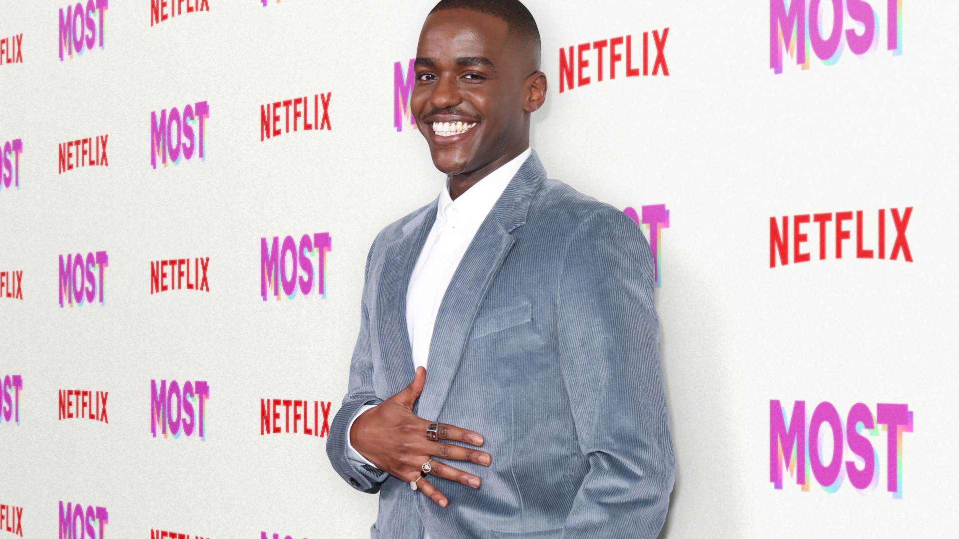
Most is Netflix’s Queer editorial vertical. It’s where they bring all their incredible LGBTQ+ storytelling, characters, and talent together for an ongoing conversation (and the occasional Kiki) with the community and super fans. Most (formerly “The Most”) had been around a while with a strong social media following, but the Netflix editorial team wanted to refresh the platform, making it more inclusive and broadening its reach into other channels like events and branded content. I worked with a team at Public Address Studio to redefine the visual brand and motion design language. We began by re-imagining the classic queer rainbow as an ever-evolving iridescent texture and image treatment. We also created a type system that integrated Netflix Brand fonts with more expressive accent typefaces. In the end, we developed a look & feel that was simple and bold enough to stand for something, but flexible enough to encompass as many new perspectives as possible.
Netflix: Most
Client: Netflix, Public Address
Role: Creative Director
Team: Chris Braden, Jacqueline Lane, Bartosz Gawdzik, Annie Milova, Noah Nathan, Gabrielle Korn